In-App Help was last updated in 8.6.4 (released 10/23/2019) if you are looking for help with a feature that has been added or enhanced since 8.6.4, please check in Online Help from Help menu.
The Monthly Average Acuity Level Report
The report analyzes trends in the monthly average acuity level over a selected time range, up to a maximum of 12 months. The report can also display the average acuity levels by day of week. The report calculates the average acuity value using data from completed patient acuity assessments and default acuity levels.
Data is reported by Service Line, Profile, or Location. You can select to have the report display data as a table, a graph, or both.
Running the Monthly Average Acuity Level Report
Complete the following steps to run the Monthly Average Acuity Level report:
- From the Reports menu, select Acuity > Monthly Average Acuity Level. The selection criteria page opens.
- Select one or more Facilities. Use CTRL+click to select multiple items. Use SHIFT+click to select a range of items.
- Select a Report by method by first selecting a category, then selecting from the available options.
- Select to report by Service Line, Profile, or Location. The page updates the values in the selection box based on the item you select.
- Select one or more Service Lines, Profiles, or Locations.
- Enter a start date in the box or click the calendar icon to use the date menu.
- Enter an end date in the box or click the calendar icon to use the date menu. The end date can be no more than 12 months from the start date. When running the report for a 12-month period, you should limit the number of service lines, profiles, or locations to six or less to reduce the amount of data the application needs to process.
- Select from the Report Includes options. Before selecting graph options, you should be aware that the maximum number of service lines, profiles, or locations that can be displayed as a graph is 12. In addition, the graph is best viewed in color (either on the monitor or by printing the report in color) when more than one service line, profile, or location is selected.
- Selecting Summary Table includes the acuity averages as a table only.
- Selecting Summary Graph includes the acuity averages as a graph.
- Selecting Detail by Day of Week Table includes the acuity averages by day of week as a table only.
- Selecting Detail by Day of Week Graph includes the acuity averages by day of week as a graph.
- Select an Export Type.
- If you select PDF, Staff Manager opens the report results as a PDF.
- If you select Microsoft Office Excel, Staff Manager exports the report results as an Excel spreadsheet. You must have Microsoft Office Excel or Excel Viewer installed on your workstation to use this option.
- Click Run Report. If you selected the PDF export type, the report is displayed in the Report Output pane. If you selected the Excel export type, an alert window opens to let you select whether to open the report or to save the report as an Excel spreadsheet. It is recommended that you select Save so that you can review the report in Excel.
You should be aware that report formatting is not retained when exporting a report to Excel.
Viewing the Monthly Average Acuity Level Report
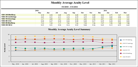
This report trends the average acuity level by the month for selected service lines, profiles, or locations.
If you selected to include the Summary table, the report displays the following data in a table format:
- Service Line, Profile, or Location: The service line, profile, or location you selected in the report.
- Month: A separate column for each month selected for the report period.
- Average Acuity Level: The average acuity level for the month.
If you selected to include the Summary Graph, the report displays the following information for each service line, profile, or location in the report period:
- A graph charting the average acuity level for each month for the report period. The acuity level displays along the vertical axis; each month of the report displays along the horizontal axis.
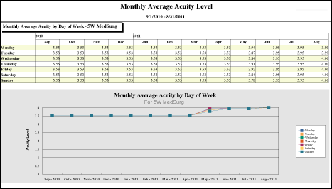
If you selected to include the Detail by Day of Week table, the report displays the following data in a separate table for each service line, profile, or location:
- Day of the week: Each day of the week will show on a separate row, starting with Monday.
- Month: A separate column for each month selected for the report period.
- Average Acuity Level: The average acuity level for the day of week.
If you selected to include the Detail by Day of Week Graph, the report displays the following information in a separate graph for each service line, profile, or location during the report period:
- A graph charting the average acuity level for each month by day of week for the report period. The acuity level displays along the vertical axis; each month of the report displays along the horizontal axis.
Sample Report
The following illustration shows the Summary with Graph option.
This illustration shows the Detail by Day of Week with Graph option.
 Related Topics