In-App Help was last updated in 8.6.4 (released 10/23/2019) if you are looking for help with a feature that has been added or enhanced since 8.6.4, please check in Online Help from Help menu.
The Productivity Report
The Productivity report provides an analysis of productivity over any period, both retrospectively and prospectively. You can view data such as actual vs. budgeted time, percent utilization, actual Hours per Patient Day (HPPD), and budgeted HPPD.
You cannot set a filter in the Productivity Report. Instead, you should use the Report Selection page to limit the data included in the report.
Clairvia Web saves the options you select for each report by your user login once you click Run Report.
If you have never run the Productivity Report before, review the following information before running the report. If you are familiar with the report, you can go directly to the steps for running the report.
Settings Affecting the Productivity Report
Settings in other parts of Staff Manager affect how the Productivity Report displays items. The following list covers the Productivity Report items and the settings their related dialog boxes and options must use for the report to display these items.
Settings in Staff Manager Client
- Target Hours: The report calculates Target hours based upon the workload entered and come from the Workload Matrix.
- Productive Hours: Assignments dialog box, Task tab: % Coverage value should be between 1% and 100% (should not be 0).
- Traveler/Contractor Hours: Employee Jobs/Skills dialog box: Traveler/Contractor check box must be selected for traveler/contractor employee.
- Productive Dollars: Edit Job dialog box (opened via the Employee Jobs/Skills dialog box): Hourly Rate must be a value other than 0.00 for the report period.
- Overtime: Users may set up Overtime at the Profile level in Staff Manager Administrator, at the employee level in Staff Manager Client, or in both places.
- Employees dialog box, Payroll tab: Either the Overtime Daily or the Overtime Weekly box must contain a value other than None. The associated After_Hours box value must be greater than zero. If either the Overtime Daily or the Overtime Weekly box has the Use Profile Settings value selected, then you must set overtime settings for the employee’s profile in Staff Manager Administrator (see Settings in Staff Manager Administrator below).
- Edit Job dialog box (opened via the Employee Jobs/Skills dialog box): The Salaried Employee check box must not be selected for the employee.
- Assignments dialog box, Task Control tab: Either the Count Toward OT check box must be selected or, if all worked hours for a task are overtime, the Count Directly To OT check box must be selected.
- Overtime Dollars:
- Employees dialog box, Payroll tab: Set Overtime multiplier to a number greater than 1. If Use profile Settings selected for Overtime Daily or Overtime Weekly, then OT settings need to be set for the employee’s profile in Staff Manager Administrator (see below).
- Edit Job dialog box (opened via the Employee Jobs/Skills dialog box): Salaried Employee check box should not be selected for the employee. Employees designated as salaried employees never count toward overtime no matter how many hours they work.
- Budget Hours: Users can set all the Budget entries below for Daily, or users can set different values by individual days of the week. If a user selects Daily, however, they must select all the days of week check boxes too. Otherwise, the report returns budget values for those days as zeroes (0).
- Shift Categories dialog box: % Allocations of shifts must be greater than 0%.
- Budget Data dialog box: Productive Hours must be a value greater than 0.00.
- Budget Dollars: Budget Data dialog box, Productive Dollars must be a value greater than 0.00.
- Budget Overtime Hours: Budget Data dialog box, Budget Overtime hours must be a value greater than 0.00.
Settings in Staff Manager Administrator
- Workload Measurement Label: Edit Profile dialog box, Workload tab: Staff Manager uses the value in the Workload Measurement Label box as the heading of the volume column. If the box is blank, Staff Manager uses the default value of Volume.
- Sum Volume by Day: Edit Profile dialog box, Workload tab: Profiles using the Workload Class methodology have the option to sum volume by day. See Reports and Volume for more information about this option and how it affects reports.
- Overtime Hours: Edit Profile dialog box, Pay Rate tab: Set Overtime Daily and Overtime Weekly to a setting other than None. Set After Hours to a value greater than zero (0).
- Overtime Dollars: Edit Profile dialog box, Pay Rate tab: Set the Overtime Multiplier to a value greater than zero (0).
Running the Productivity Report
Complete the following steps to run the Productivity report:
- From the Reports menu, select Management > Productivity Report. The Productivity Report page opens.
- Select a profile or profiles. Use CTRL+click to select multiple items. Use SHIFT+click to select a range of items. If you are logged in as an administrator, you can select from all the profiles in the database. If you are logged in as an employee who can manage profiles, only those profiles to which you have access are displayed in the menu.
-
Enter a start date in the box or click the calendar icon to use the date menu.
- Select a time period. Enter a numeric value in the box, then select Days, Weeks, or Months. For example, if you enter 12 in the box and then click Days, the report displays 12 days of data starting with your selected Start Date.
- Select what to Report On: Hours, FTEs, Hours/UOS (Hours per Unit of Service), or a combination.
- Reporting in Hours: Provides data based on target, budget, and productive hours.
- Reporting in FTEs: Produces different results depending on the length of the report interval and the number of days the profile is identified as Open. If the report interval or number of days open is less than seven days, the report uses the daily coverage calculation to calculate the hours and divides the hours by the FTE Conversion Factor (Daily). If the report interval or number of days open is seven days or more, the report uses the following formula: Productive Hours/[FTE Conversion Factor (FIN) * Number of days open in report period]. Be aware that if an employee works on a day that a profile is normally closed, this affects the days open value. For example, assume Profile 1 is open Monday through Friday and closed on Saturday and Sunday. This gives Profile 1 a days open value of 5. If a Profile 1 employee works on a Saturday, Staff Manager adds an extra day to the days open value to account for the additional worked hours. This gives Profile 1 a days open value of 6, which Staff Manager uses for all calculations including FTEs and averages during the selected reporting period.
- Reporting in Hours/UOS: Provides data based on target, budget, and productive hours per unit of service. This affects only those values that report in hours (Productive, Target, Variances, Float, Agency, and Traveler/Contract Hours).
- Select what the Report Includes. When running the Productivity Report for ancillary departments that sum volume by day, such as Respiratory, Radiology, or Emergency, the Summary and Detail by Skill options are the most useful.
- Summary
- Detail by Partition/Skill
- Detail by Skill
- Select to include Graphs in Hours/UOS with Variances, Cumulative Variances, or both. The Variance graph plots the variance between productive and target hours per unit of service, and the Cumulative Variance graph plots the cumulative variance between productive hours per unit of service and target hours per unit of service.
- Select an Export Type.
- If you select PDF, Clairvia Web opens the report results as a PDF.
- If you select CSV (Comma Separated Values), Clairvia Web exports the report results as a CSV file. You can open and edit CSV files in spreadsheet programs such as Microsoft Office Excel.
- If you select Email (Includes PDF and CSV), the application emails exports the report in both forms and emails them to the address or addresses you include in the Email Recipients box.
- Enter your email address in the Email Recipients box. If you want, you can also add additional email addresses to send the report to other people. When entering multiple addresses, separate the email addresses with the punctuation used by your facility; this is usually a comma (,) or a semi-colon (;). The report uses the exact text you enter here in the email To: line when sending the report output.
- Click Run Report. The solution reviews your report selections. If there are any invalid selections or entries, the page displays an error message prompting you to make corrections. What the page displays next depends on your selected export type:
- PDF: The report opens in the Report Output tab.
- CSV: An alert message displays the message What you want to do with productivity.csv? You have three options:
- Click Open to open the CSV file in your default CSV editor, such as Notepad or Microsoft Excel. Be aware that report formatting is not always retained when you export a report to Excel in CSV format. Opening a CSV file in Excel may change the format of the data. To view CSV files as they are exported from Clairvia Web, it is recommended that you open the file in a text editor application such as Notepad.
- Click Save to save the productivity.csv to your download folder.
- Click Save as to select where you want to save the report. You can also rename the report file, if you want.
- Email: The page displays the following message:
Report Submitted
Your report has been submitted and will be processed as quickly as possible. The report process may take several hours to complete.
You will receive an email confirmation for submitting the report and an email notification when the report is ready. Click OK to close the message box.
The term Unit of Service or UOS has replaced HPPD in Clairvia Web reports. Hours per unit of service are the total productive hours divided by the unit of service for a department for a specific period, usually a day. This label is set by profile in Staff Manager Client. Cerner recommends that you select a label of six characters or less in this box. For example, PD for Patient Day would be an option in inpatient nursing, Proc for Procedure in radiology, and so on.
To print the report, see Printing Reports.
Viewing the Productivity Report
The Productivity Report displays values in hours, FTEs, Hours/UOS, or a combination of these, depending on what you selected on the report selection page. The report can also have one to four sections, depending on your report selections.
- Productivity Graphs: You can select to display an Hours/UOS variance graph, a cumulative variance graph, or both, but the report can only graph one profile at a time. If you run a Productivity Report on multiple profiles, the report only displays graphs for the first profile.
- Summary: Displays a total of all the data for the parameters selected on the selection page. In the summary section of the report, the term UOS is used, since different profiles can have different labels for UOS.
- Detail by Partition and Skill: Displays breakdown by shift category partition and skill with totals. The first column is headed by the profile's Workload Measurement Label or by Volume if the profile has not set a label. In this section, the term UOS is replaced by your unit of service as listed in Staff Manager Client's Budget Data dialog box.
- Detail by Skill: Displays breakdown by skill with totals. The total also includes the Average Daily Census for the report interval. As in the Detail by Partition and Skill section, UOS is replaced by your Label for UOS.
Viewing the Productivity Graphs
When you run the Summary, Detail by Partition/Skill, Detail by Skill, and Graph Hours/UOS reports for multiple profiles (such as Profiles A and B), the report displays the information as follows.
- Graphs for Profile A.
- Summary Report for Profiles A and B and the combined total.
- Detail by Partition/Skill for Profile A.
- Detail by Skill for Profile A.
- Detail by Partition/Skill for Profile B.
- Detail by Skill for Profile B.
The Variance Graph
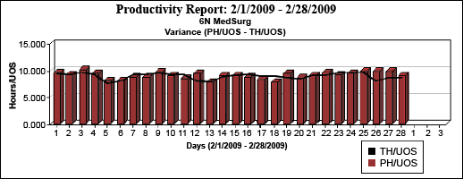
The length of the reporting period affects how the graphs display. If you select a report interval of 31 days or less, the x-axis of the graph are labeled in Days, and the number of days in the reporting period are indicated by the striped line. The following illustration shows an Hours/UOS Variance graph in days.

If you select a report interval of greater than 31 days, the x-axis of the graph are labeled in Weeks, and the number of weeks in the reporting period are indicated by the striped line. The following illustration shows an Hours/UOS Variance graph in weeks.

The Hours/UOS Variance graph compares the Productive Hours/per Unit of Service (PH/UOS) against the Target Hours per Unit of Service (TH/UOS) for the selected profile. TH/UOS are based upon workload volumes and are calculated from Workload Planner and census/volume data, or from core coverage data, depending on the data available for the selected period in Staff Manager Client.
The bar graphs display the PH/UOS and the TH/UOS are plotted in a line graph.
In the following graph, a user chose to display the variance for 28 days. On 2/1/09 and 2/2/09, the TH/UOS and PH/UOS were even or close to even. On 2/12/09, the PH/UOS exceeded the TH/UOS. On 2/18/09 the TH/UOS exceeded the PH/UOS.

The Cumulative Variance Graph
The Cumulative Variances graph displays the cumulative variance between the TH/UOS and the PH/UOS in a bar graph for each day in the specified date range, as shown in the following illustration.

For example, assume a graph is run with the following data.
| |
Day 1
|
Day 2
|
Day 3
|
|
Target Hours/UOS (TH/UOS)
|
6.0
|
6.0
|
6.0
|
|
Productive Hours/UOS (PH/UOS)
|
5.83
|
5.75
|
6.15
|
The daily and cumulative variances shown on the graph would be as follows.
| |
Day 1
|
Day 2
|
Day 3
|
|
Daily Variance (PH/UOS - TH/UOS)
|
-0.17
|
-0.25
|
+0.15
|
|
Cumulative Variance
|
-0.17
|
-0.42
|
-0.27
|
Viewing the Summary Section
When reporting by hours or FTEs, the summary section heading is Productivity Report: Start Date – End Date (Report Interval). Productivity [FTEs or Hours] Summary Report. The summary columns are as follows.
When reporting by Hours/UOS, the summary section heading is Productivity Report: Start Date – End Date (Report Interval). Productivity Hours/UOS Summary Report. The summary columns are as follows.
- Profile Name
- Cumulative Volume: Displays either the sum volume by day or the weighted average daily volume for the report interval. See Reports and Volume for more information.
- Prod. Hours: Displays the Productive Hours for the report interval.
- Target Hours: Displays the workload-based values from the Workload Planner in Staff Manager Client.
- Var Prod – Target Hours: The calculation of Productive minus Target in Hours.
- PH/UOS: Displays the calculation of the productive hours divided by the cumulative workload for the report interval.
- BH/UOS: Displays the calculation of the budget hours/UOS from the Budget Table for the report interval.
- TH/UOS: Displays the calculation of the target hours divided by the cumulative workload for the report interval.
- Var PH/UOS – BH/UOS: Displays the variance between productive hours per unit of service and budgeted hours per unit of service for the report interval.
- Var PH/UOS – TH/UOS: Displays the variance between productive hours per unit of service and target hours per unit of service for the report interval.
- $/UOS: Total productive dollars divided by the cumulative workload for the report interval.
- Float Hours: Displays productive hours provided by employees who do not have a primary or secondary job in the reported profile during the report interval.
- Agency Hours: Displays productive hours provided by employees based in profiles designated as Agency profiles. Profiles are designated as Agency profiles in Staff Manager Administrator.
- Trav/Contract: Displays productive hours provided by employees designated as Traveler/Contract during the report interval. You designate employees as Traveler/Contract in Staff Manager Client.
- Total Productive $: Displays the calculation of productive dollars based upon employee pay rates and overtime parameters set at the profile level, the employee level, or both.
- Overtime $: Displays the dollars considered overtime based upon the overtime rules set up by profile, employee, or both. Overtime dollars are also included in the total productive dollars.
The report displays totals at the bottom of the Summary report for all profiles.
Viewing the Detail by Partition and Skill Section
The heading format for detail by partition and skill is Productivity Report: Start Date – End Date (Report Interval). Productivity [FTEs or Hours] with Detail by Partition and Skill for [Profile Name]. If reporting by Hours or FTEs, the columns are as follows.
If reporting by Hours/UOS, the detail columns are as follows.
Viewing the Detail by Skill Section
The heading format for detail by skill is Productivity Report: Start Date – End Date (Report Interval). Productivity [FTEs or Hours] with Detail by Skill for [Profile Name].
The detail columns are the same as those for the Detail by Partition and Skill.
Notes on Formatting
Cumulative volume values are followed by CUM and average workload values by Avg.
Variances: Positive variances display/print in bold red type; negative variances display/print in italic blue type. The use of bold and italics provides a visual flag when printing in black and white.
Sample Reports
The following illustration shows a sample of all three reporting options: Summary, Detail by Partition and Skill, and Detail by Skill.

- Workload measurement label
- Bold red text indicating a positive variance
- Italic blue text indicating a negative variance
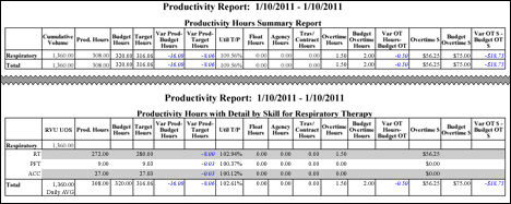
The following illustration shows a Productivity Report for the ancillary department Respiratory Therapy. The report displays the Summary and Detail by Skill. These are the most useful sections when reporting for ancillary departments that sum volume by day.

The next illustration demonstrates how the totals for Float, Agency, Traveler/Contract, and Overtime Hours or FTEs are subcategories of the Productive Hours or FTEs total. In this example, the user ran the report by Hours, with total hours in each of these categories added into the total for Productive Hours.

 Related Topics
![]()
![]()


